Hightouch
2021-2023
Background
I joined Hightouch’s in the Spring of 2021 as the founding product designer. At the time, Hightouch had a core product in place, designed by their front-end engineer. It did the job as a reverse ETL tool that helped business teams sync data from warehouses back to the tools they used everyday. It solved complex data integration pains for developers.
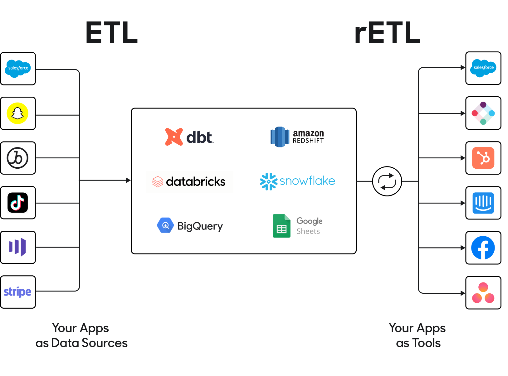
The difference between ETL tools (like Fivetran) and Reverse ETL
My responsibility was to help grow the platform to scale along with use cases that were important to our customers. Initially we were serving data engineers, and later on less technical users--namely marketers. Their workflows were extremely time-consuming. Our design principles were:
- Acceleration: Help users focus on what’s important, and design meaningful calls-to-action
- Empowerment: Don’t overwhelm users, allow them to safely make mistakes
- Education: Explain relationships between different resources and flows, respect user expectations, maintain context
Auditing the existing app
One of the first things I did was audit the existing app UI flows to understand where the debt was, according to commonly understood design heuristics:
- Visual inconsistency (e.g. improper color usage)
- Patterns that don’t scale well (e.g. horizontal steppers beyond 3 steps)
- Unclear calls to action (e.g. the “Preview” model query button was a primary CTA alongside “Save”, causing friction when deciding which to click first)
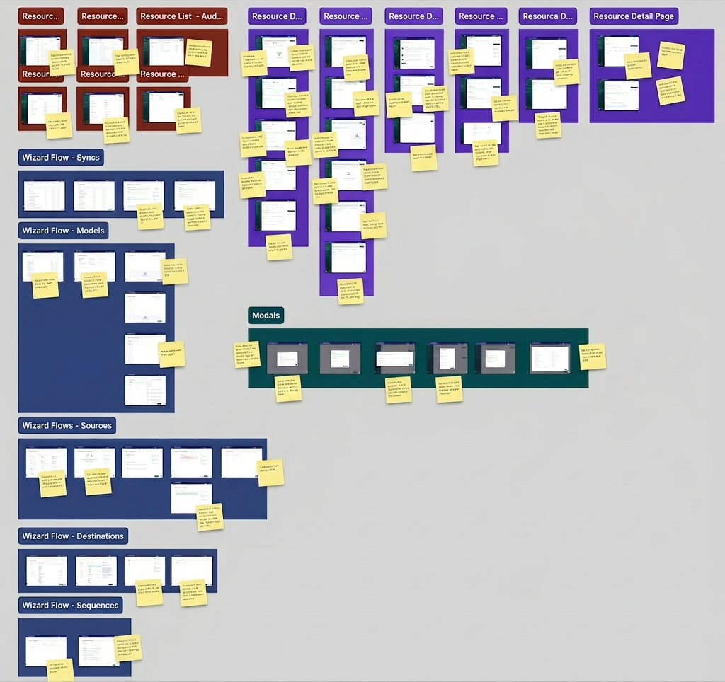
I worked on establishing a standardized UX by auditing the existing design, identifying pain points and opportunities both in terms of workflow friction and UI inconsistency. This helped me manage context in my mind so that I could begin to think about solutions at a systems level.
Researching user pain points
Early on I conducted user interviews with real customers over Zoom, and began to log recurring concerns to help prioritize them for design sprints.
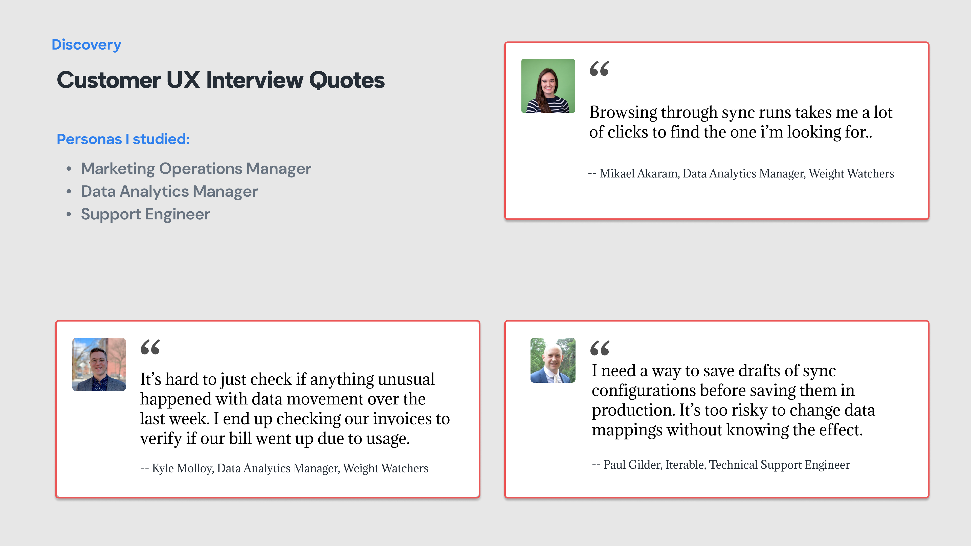
A lot of feedback had to do with improving speed to resolution of syncing issues: I synthesized that category of feedback accordingly:
- Too many clicks to get error information
- Hard to understand what requires my attention
- Status badges are hard to interpret
- Filters were hard to create and maintain
- Its hard to understand “the lay of the land”
Designing components
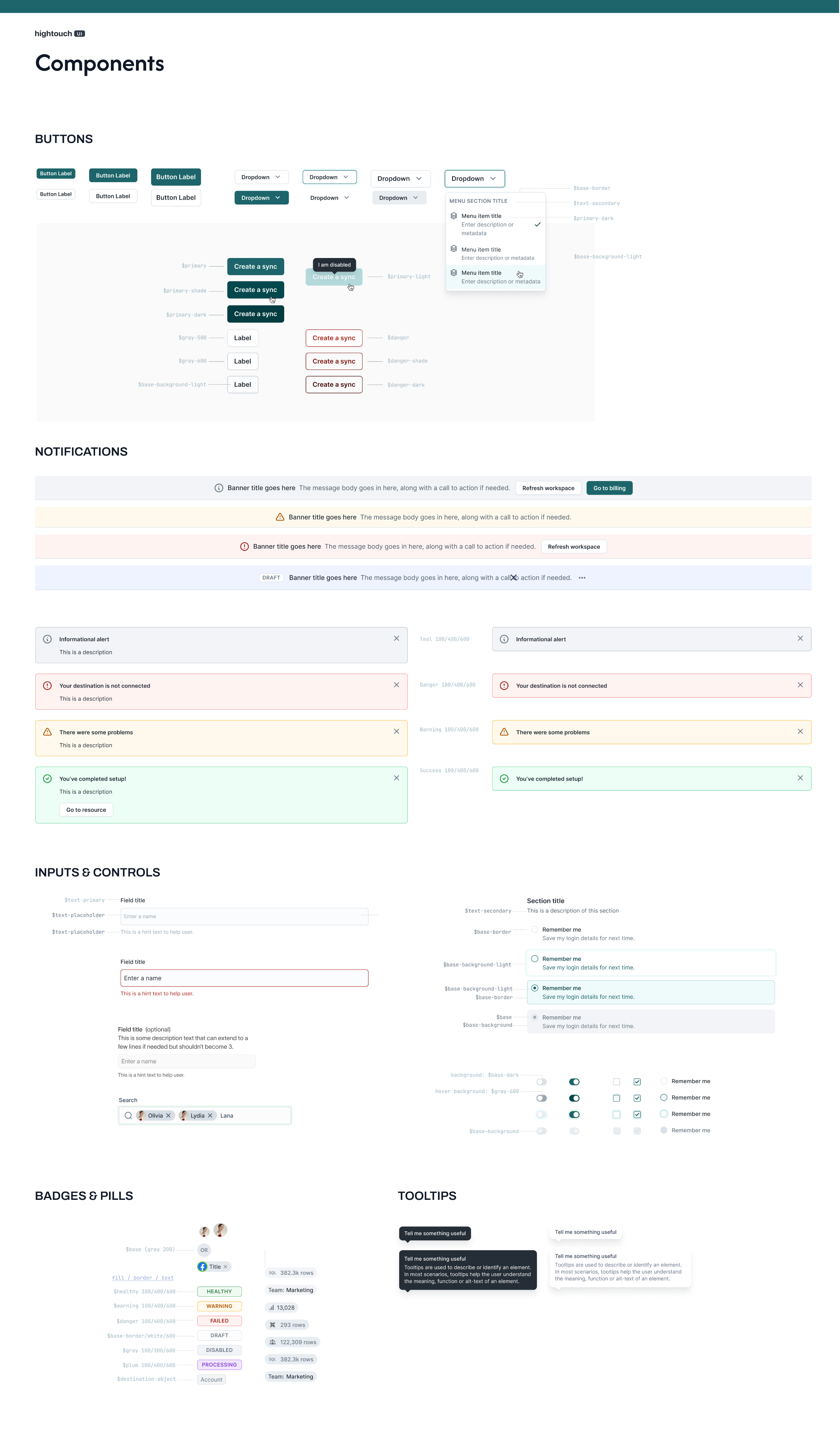
Collection of common components after an early standardization milestone was reached
Visual design system
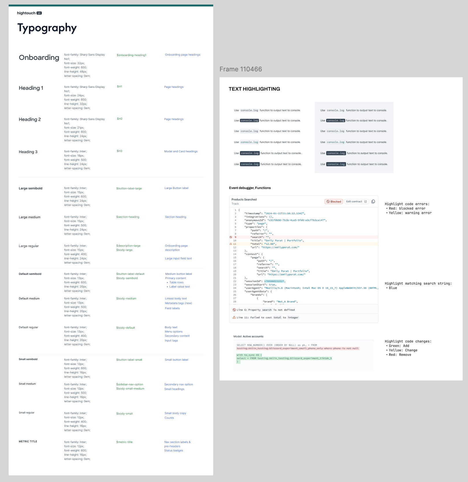
Collection of common components after an early standardization milestone was reached
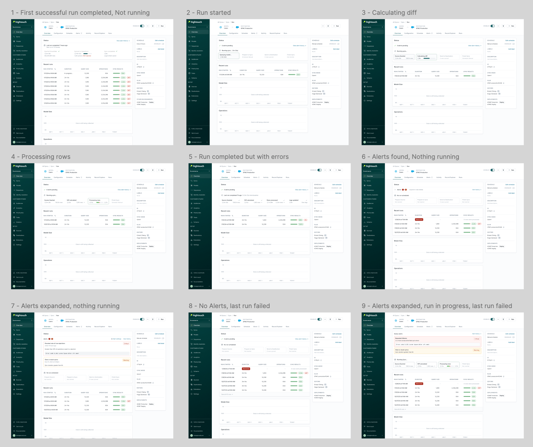
Page states of the sync detail page
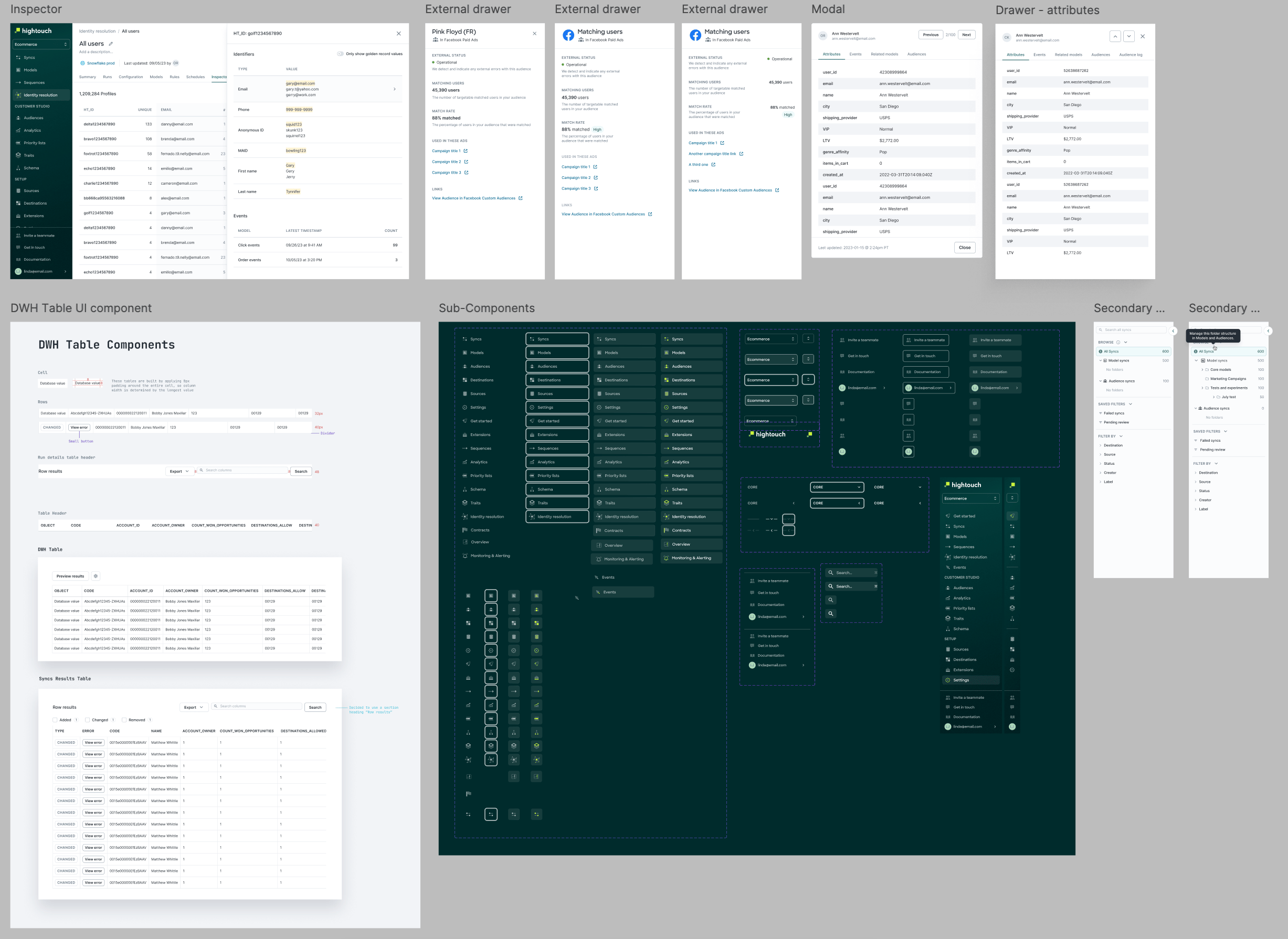
Application components/patterns
Building towards a vision
Taking into account learnings from research, we began thinking through the information architecture of the app, including the landing page which was previously just a list of active syncs. We learned what was important to users and it all boiled down to finding recent errors and quickly debugging them. We had to consider interaction design, content design and tie it together in a cohesive interface.
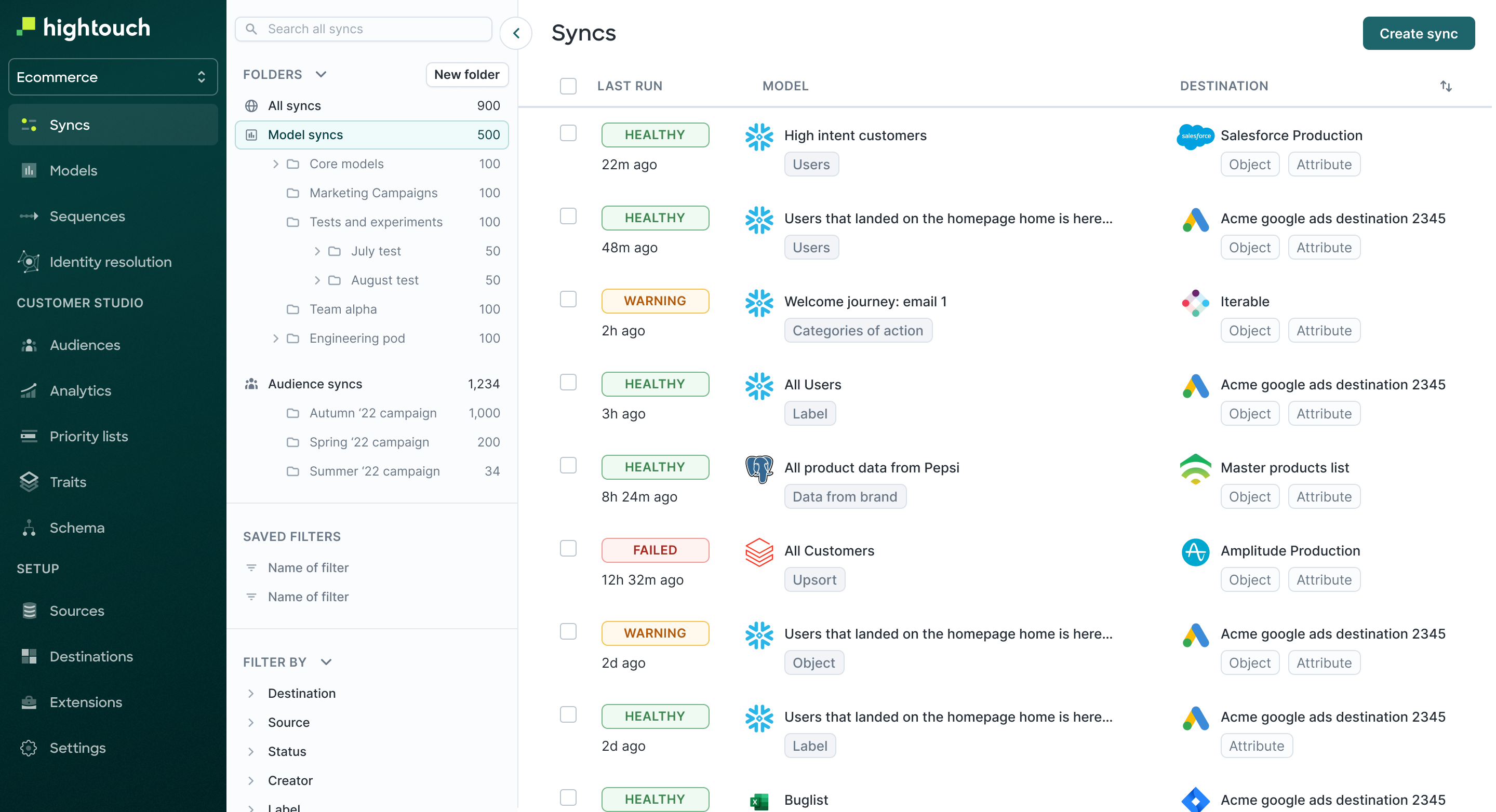
This was the state of the app’s landing page at the time of doing the aforementioned research round. As usage scaled, this view aggregated individual syncs and was became noisy as usage scaled, even after introducing folders.
Along with my PM & the founding engineer, we brainstormed ideas for content that would be useful for users to see as the first thing upon logging in. We were able to prioritize the best ideas after additional feedback from customers.
Some artifacts from the scoping/shaping process for the dashboard design
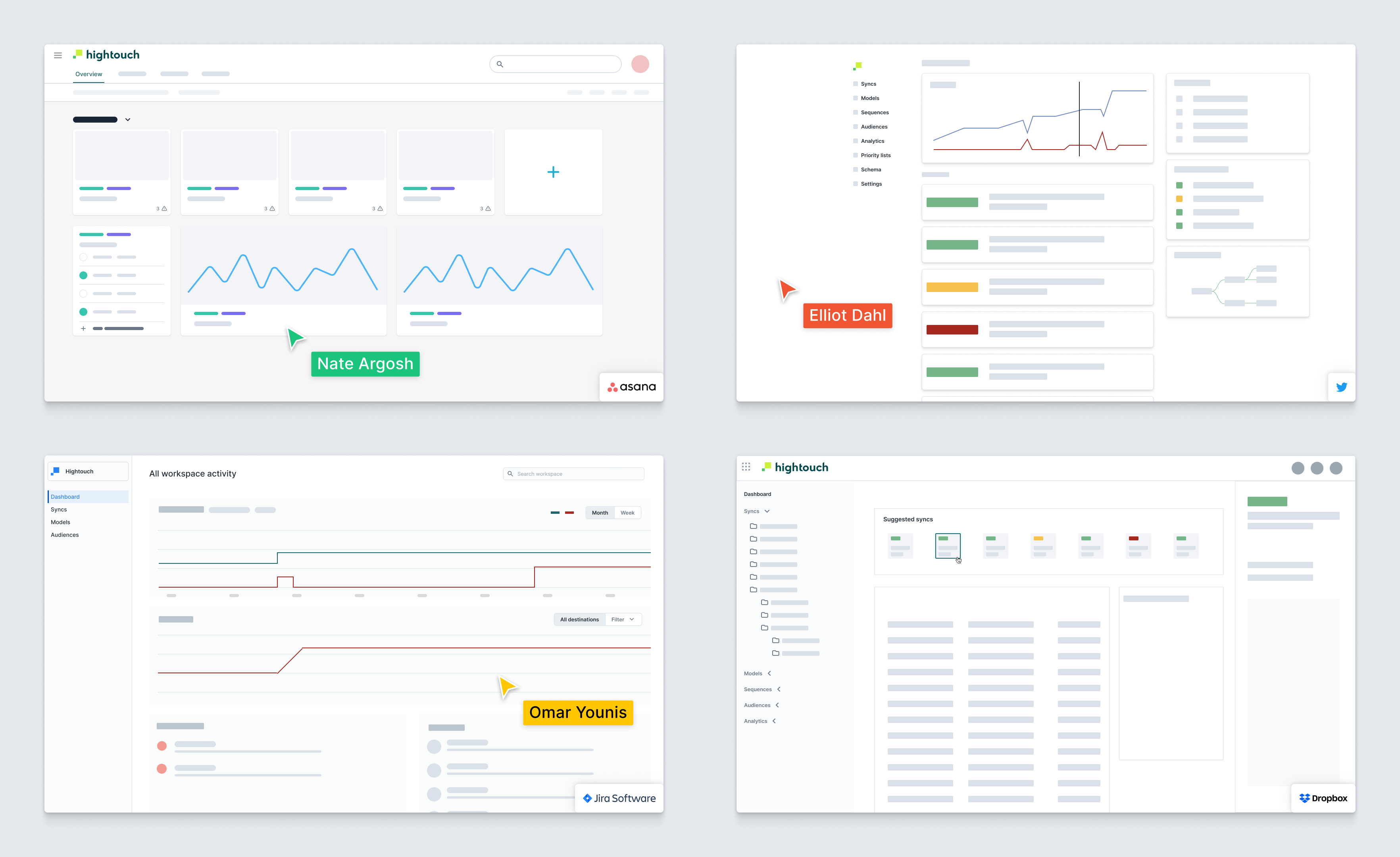
I led a live design jam where the prompt was to imagine a dashboard layout that would help users actively monitor the things they cared about.
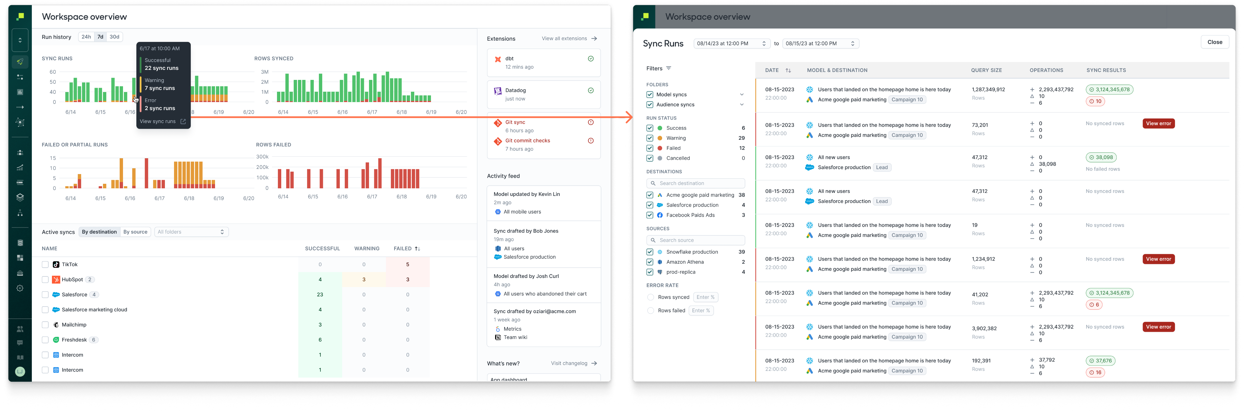
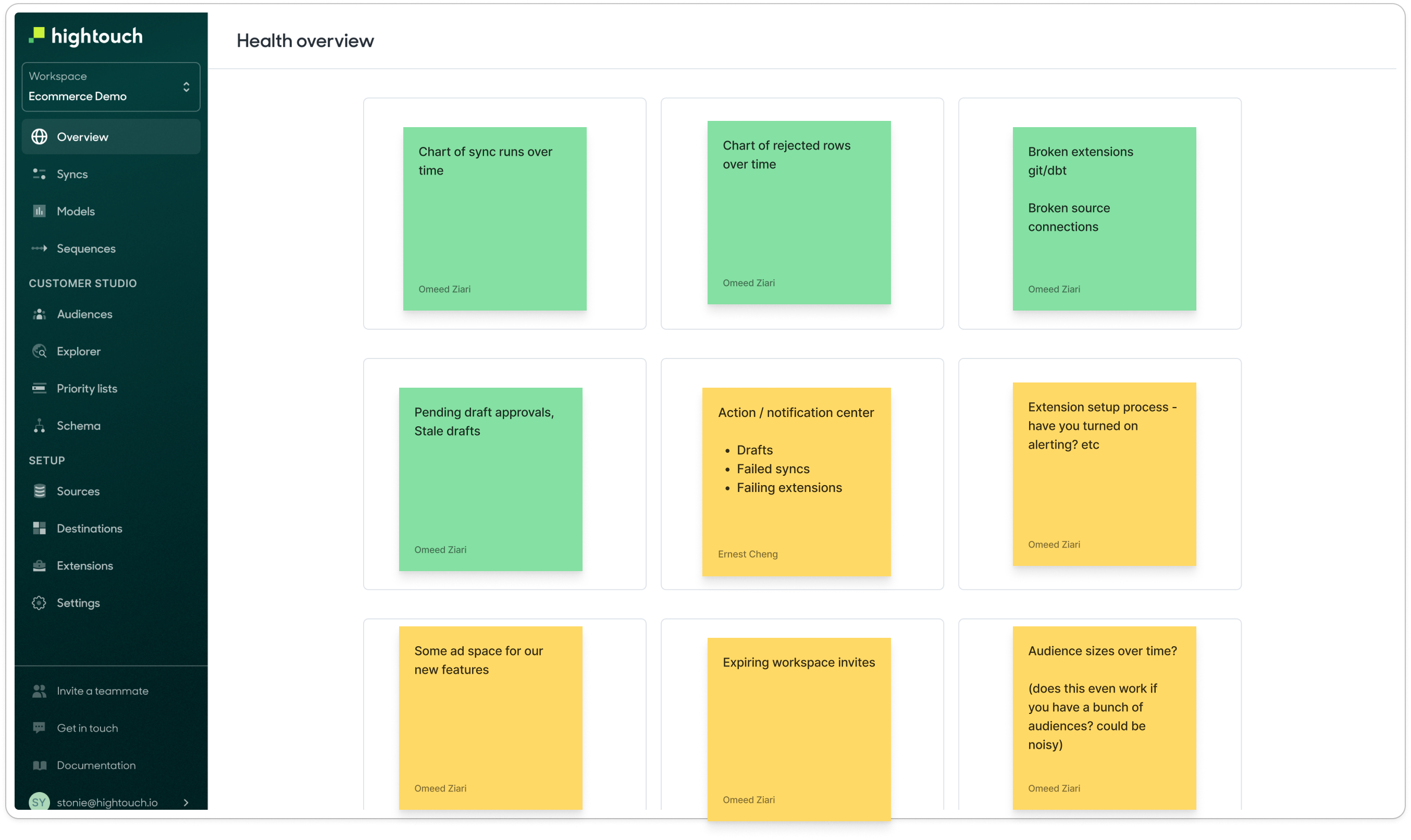
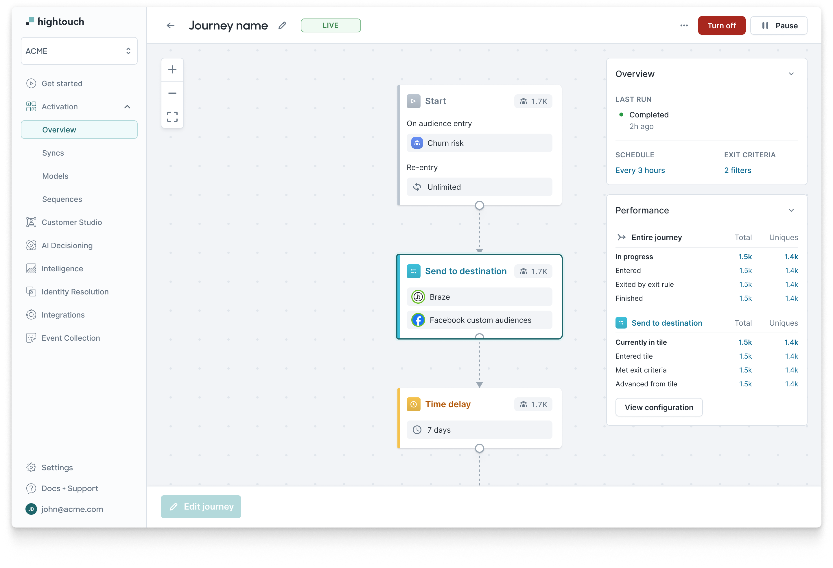
First released version of the dashboard for workspaces. This allowed users to jump into a viewing a set of sync runs that correspond to a recent point in time across syncs and destinations rather than hunting for problematic sync runs.
Optimizing core workflows
In addition to observability, users of Hightouch also create data pipelines and configure them to meet the needs of their data teams and downstream consumers. If users run into difficulty getting these core resources set up, they may decide to abandon the process leading to lower adoption rates. Balancing the optimization of core workflows with a larger vision was a challenge for a lean startup with 1 designer.
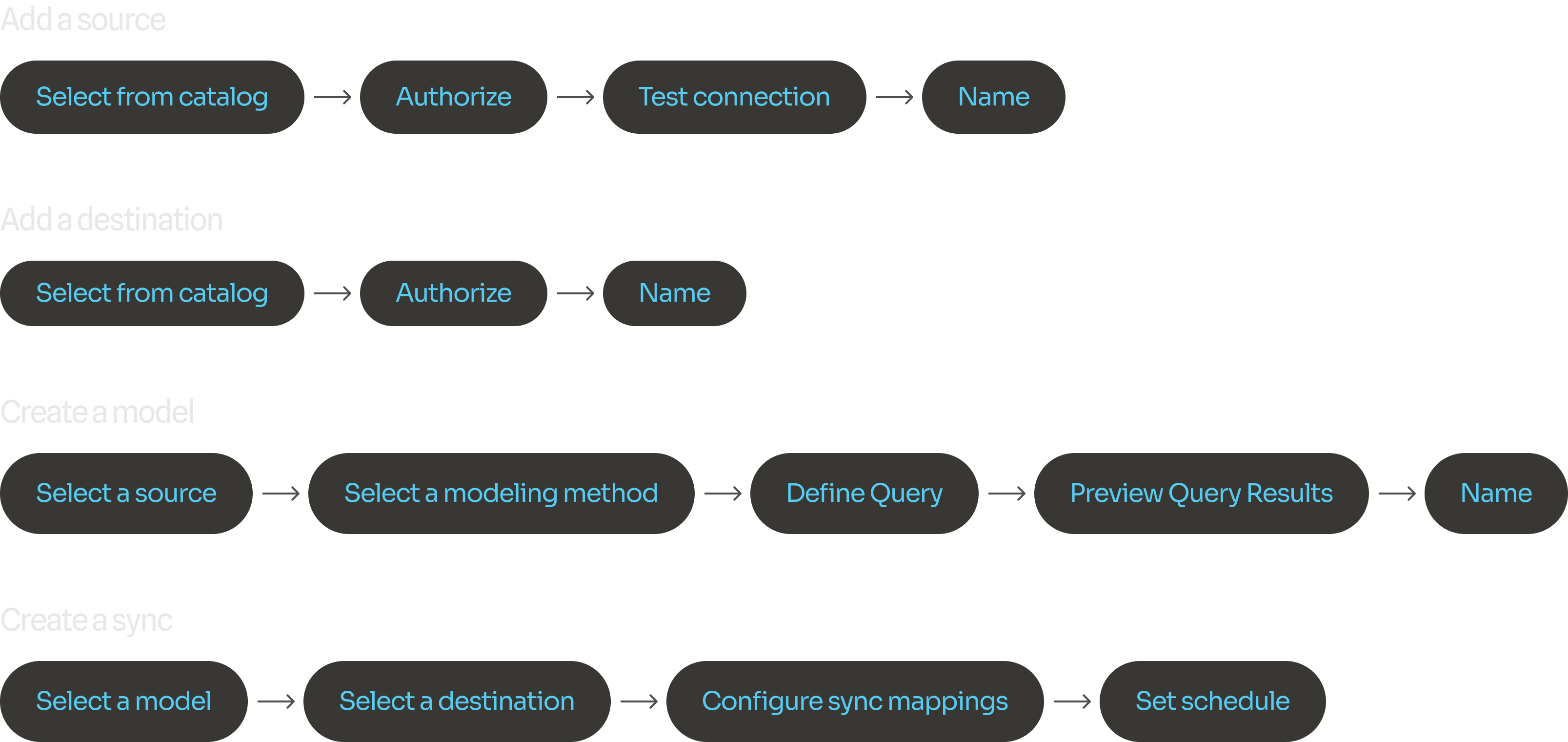
Each step in our core workflows was revisited and optimized to avoid user confusion and allow pathways to support.
Hypothesizing value proposition for Data Activation
Companies want to help their business teams activate data from the warehouse, so that data teams can deliver clean, transformed data directly from the warhouse to hundreds of downstream operational tools in minutes.
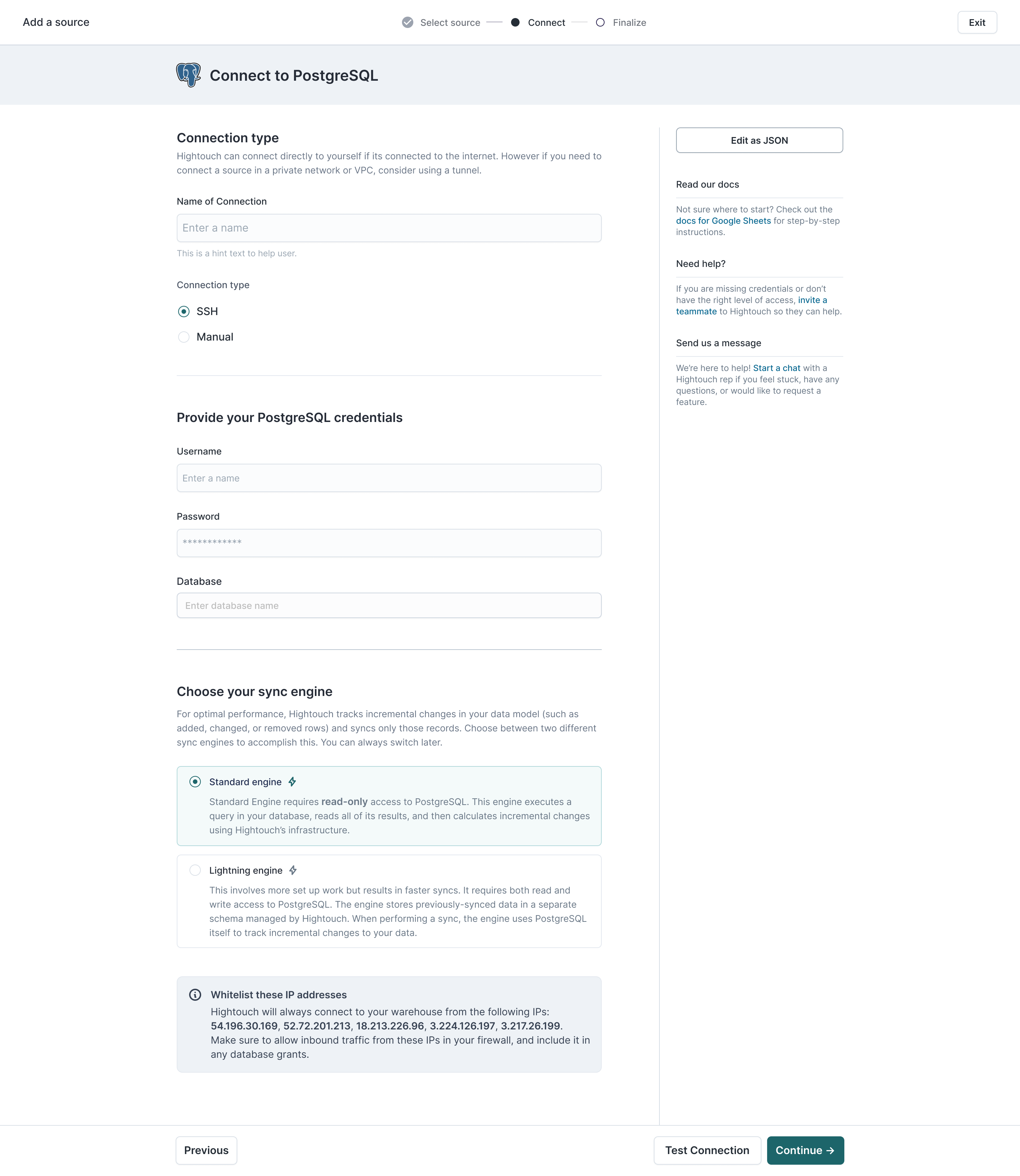
Working with my team (PM, Engineers) to optimize our onboarding flow to begin learning whether the value proposition was compelling enough for business teams to understand right away.
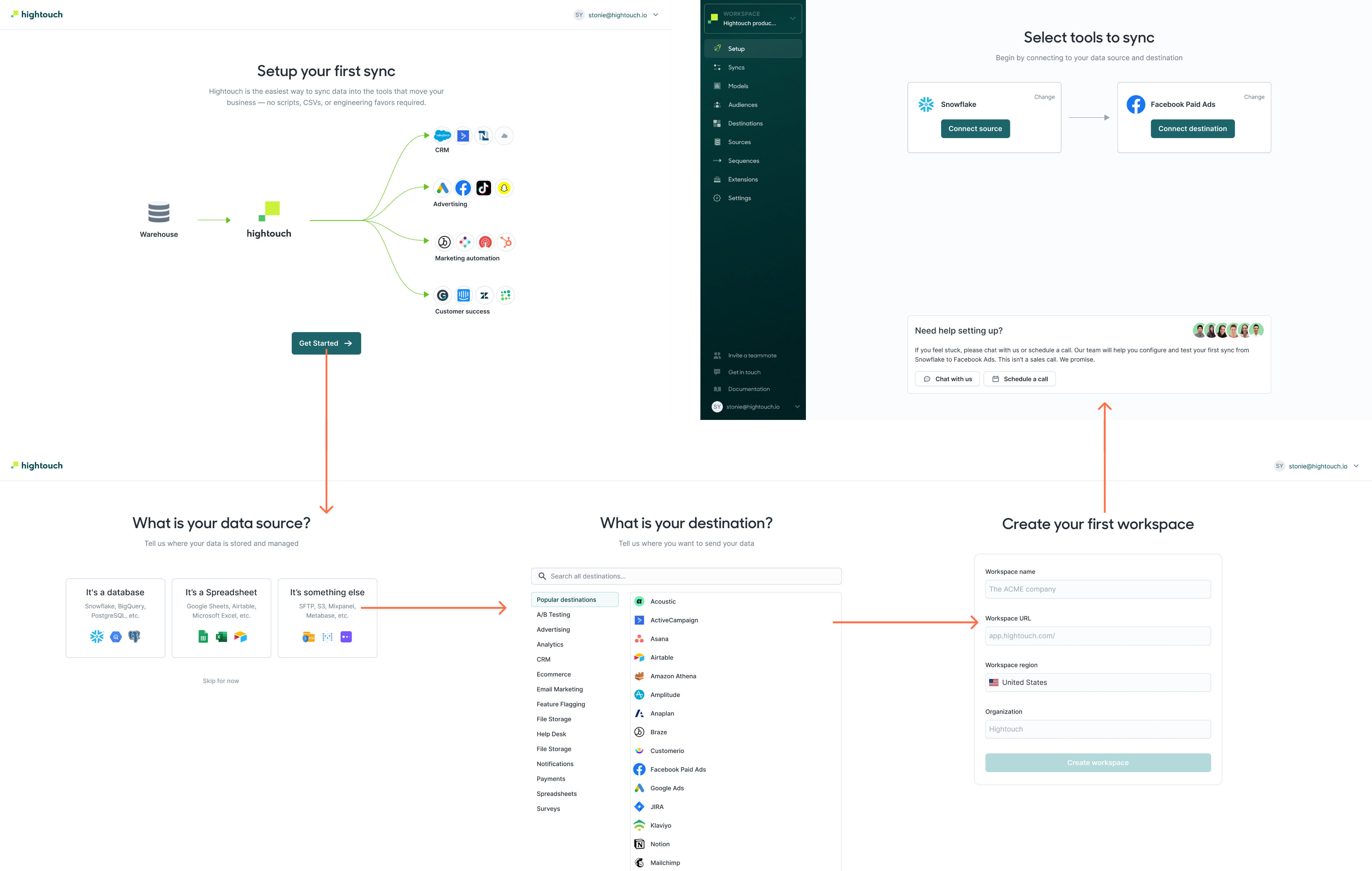
The feedback we were getting mostly had to do with confusion around vertically integrated use cases. Which sources should i connect? Which destinations? And when? This initial iteration helped us learn where customers were facing friction and uncertainty, and later we introduced more use-case oriented onboarding.
Wrap up
After achieving the goal of reducing design debt within the core experience, I shifted to work on enterprise-focused features such as RBAC and deployments which were built on top of the established foundation. I also had a chance to work on marketer-focused features such as Journeys and the Audience builder.
What I learned is that organizations that serve the needs of data teams are not likely to commit to a product solution based on just playing in a self-serve fashion. The best we can do is make things as simple as possible, provide guardrails and governance features, while providing avenues to seek help. Customers tend to engage our with our extra-product content such as explainer videos and documentation, learn from demos, then return to the product to achieve their desired outcomes once their questions are answered.
Hightouch
2021-2023
Background
I joined Hightouch’s in the Spring of 2021 as the founding product designer. At the time, Hightouch had a core product in place, designed by their front-end engineer. It did the job as a reverse ETL tool that helped business teams sync data from warehouses back to the tools they used everyday. It solved complex data integration pains for developers.
The difference between ETL tools (like Fivetran) and Reverse ETL
My responsibility was to help grow the platform to scale along with use cases that were important to our customers. Initially we were serving data engineers, and later on less technical users--namely marketers. Their workflows were extremely time-consuming. Our design principles were:
- Acceleration: Help users focus on what’s important, and design meaningful calls-to-action
- Empowerment: Don’t overwhelm users, allow them to safely make mistakes
- Education: Explain relationships between different resources and flows, respect user expectations, maintain context
Auditing the existing app
One of the first things I did was audit the existing app UI flows to understand where the debt was, according to commonly understood design heuristics:
- Visual inconsistency (e.g. improper color usage)
- Patterns that don’t scale well (e.g. horizontal steppers beyond 3 steps)
- Unclear calls to action (e.g. the “Preview” model query button was a primary CTA alongside “Save”, causing friction when deciding which to click first)
I worked on establishing a standardized UX by auditing the existing design, identifying pain points and opportunities both in terms of workflow friction and UI inconsistency. This helped me manage context in my mind so that I could begin to think about solutions at a systems level.
Researching user pain points
Early on I conducted user interviews with real customers over Zoom, and began to log recurring concerns to help prioritize them for design sprints.
A lot of feedback had to do with improving speed to resolution of syncing issues: I synthesized that category of feedback accordingly:
- Too many clicks to get error information
- Hard to understand what requires my attention
- Status badges are hard to interpret
- Filters were hard to create and maintain
- Its hard to understand “the lay of the land”
Designing components
Collection of common components after an early standardization milestone was reached
Visual design system
Collection of common components after an early standardization milestone was reached
Page states of the sync detail page
Application components/patterns
Building towards a vision
Taking into account learnings from research, we began thinking through the information architecture of the app, including the landing page which was previously just a list of active syncs. We learned what was important to users and it all boiled down to finding recent errors and quickly debugging them. We had to consider interaction design, content design and tie it together in a cohesive interface.
This was the state of the app’s landing page at the time of doing the aforementioned research round. As usage scaled, this view aggregated individual syncs and was became noisy as usage scaled, even after introducing folders.
Along with my PM & the founding engineer, we brainstormed ideas for content that would be useful for users to see as the first thing upon logging in. We were able to prioritize the best ideas after additional feedback from customers.
Some artifacts from the scoping/shaping process for the dashboard design
I led a live design jam where the prompt was to imagine a dashboard layout that would help users actively monitor the things they cared about.
First released version of the dashboard for workspaces. This allowed users to jump into a viewing a set of sync runs that correspond to a recent point in time across syncs and destinations rather than hunting for problematic sync runs.
Optimizing core workflows
In addition to observability, users of Hightouch also create data pipelines and configure them to meet the needs of their data teams and downstream consumers. If users run into difficulty getting these core resources set up, they may decide to abandon the process leading to lower adoption rates. Balancing the optimization of core workflows with a larger vision was a challenge for a lean startup with 1 designer.
Each step in our core workflows was revisited and optimized to avoid user confusion and allow pathways to support.
Hypothesizing value proposition for Data Activation
Companies want to help their business teams activate data from the warehouse, so that data teams can deliver clean, transformed data directly from the warhouse to hundreds of downstream operational tools in minutes.
Working with my team (PM, Engineers) to optimize our onboarding flow to begin learning whether the value proposition was compelling enough for business teams to understand right away.
The feedback we were getting mostly had to do with confusion around vertically integrated use cases. Which sources should i connect? Which destinations? And when? This initial iteration helped us learn where customers were facing friction and uncertainty, and later we introduced more use-case oriented onboarding.
Wrap up
After achieving the goal of reducing design debt within the core experience, I shifted to work on enterprise-focused features such as RBAC and deployments which were built on top of the established foundation. I also had a chance to work on marketer-focused features such as Journeys and the Audience builder.
What I learned is that organizations that serve the needs of data teams are not likely to commit to a product solution based on just playing in a self-serve fashion. The best we can do is make things as simple as possible, provide guardrails and governance features, while providing avenues to seek help. Customers who engage our exta-product content such as videos and documentation can learn from demos, then return to the product to achieve their desired outcomes once their questions are answered.
What I learned is that organizations that serve the needs of data teams are not likely to commit to a product solution based on just playing in a self-serve fashion. The best we can do is make things as simple as possible, provide guardrails and governance features, while providing avenues to seek help. Customers tend to engage our with our extra-product content such as explainer videos and documentation, learn from demos, then return to the product to achieve their desired outcomes once their questions are answered.
Hightouch
2021-2023
Background
I joined Hightouch’s in the Spring of 2021 as the founding product designer. At the time, Hightouch had a core product in place, designed by their front-end engineer. It did the job as a reverse ETL tool that helped business teams sync data from warehouses back to the tools they used everyday. It solved complex data integration pains for developers.
The difference between ETL tools (like Fivetran) and Reverse ETL
My responsibility was to help grow the platform to scale along with use cases that were important to our customers. Initially we were serving data engineers, and later on less technical users--namely marketers. Their workflows were extremely time-consuming. Our design principles were:
- Acceleration: Help users focus on what’s important, and design meaningful calls-to-action
- Empowerment: Don’t overwhelm users, allow them to safely make mistakes
- Education: Explain relationships between different resources and flows, respect user expectations, maintain context
Auditing the existing app
One of the first things I did was audit the existing app UI flows to understand where the debt was, according to commonly understood design heuristics:
- Visual inconsistency (e.g. improper color usage)
- Patterns that don’t scale well (e.g. horizontal steppers beyond 3 steps)
- Unclear calls to action (e.g. the “Preview” model query button was a primary CTA alongside “Save”, causing friction when deciding which to click first)
I worked on establishing a standardized UX by auditing the existing design, identifying pain points and opportunities both in terms of workflow friction and UI inconsistency. This helped me manage context in my mind so that I could begin to think about solutions at a systems level.
Researching user pain points
Early on I conducted user interviews with real customers over Zoom, and began to log recurring concerns to help prioritize them for design sprints.
A lot of feedback had to do with improving speed to resolution of syncing issues: I synthesized that category of feedback accordingly:
- Too many clicks to get error information
- Hard to understand what requires my attention
- Status badges are hard to interpret
- Filters were hard to create and maintain
- Its hard to understand “the lay of the land”
Designing components
Collection of common components after an early standardization milestone was reached
Visual design system
Collection of common components after an early standardization milestone was reached
Page states of the sync detail page
Application components/patterns
Building towards a vision
Taking into account learnings from research, we began thinking through the information architecture of the app, including the landing page which was previously just a list of active syncs. We learned what was important to users and it all boiled down to finding recent errors and quickly debugging them. We had to consider interaction design, content design and tie it together in a cohesive interface.
This was the state of the app’s landing page at the time of doing the aforementioned research round. As usage scaled, this view aggregated individual syncs and was became noisy as usage scaled, even after introducing folders.
Along with my PM & the founding engineer, we brainstormed ideas for content that would be useful for users to see as the first thing upon logging in. We were able to prioritize the best ideas after additional feedback from customers.
Some artifacts from the scoping/shaping process for the dashboard design
I led a live design jam where the prompt was to imagine a dashboard layout that would help users actively monitor the things they cared about.
First released version of the dashboard for workspaces. This allowed users to jump into a viewing a set of sync runs that correspond to a recent point in time across syncs and destinations rather than hunting for problematic sync runs.
Optimizing core workflows
In addition to observability, users of Hightouch also create data pipelines and configure them to meet the needs of their data teams and downstream consumers. If users run into difficulty getting these core resources set up, they may decide to abandon the process leading to lower adoption rates. Balancing the optimization of core workflows with a larger vision was a challenge for a lean startup with 1 designer.
Each step in our core workflows was revisited and optimized to avoid user confusion and allow pathways to support.
Hypothesizing value proposition for Data Activation
Companies want to help their business teams activate data from the warehouse, so that data teams can deliver clean, transformed data directly from the warhouse to hundreds of downstream operational tools in minutes.
Working with my team (PM, Engineers) to optimize our onboarding flow to begin learning whether the value proposition was compelling enough for business teams to understand right away.
The feedback we were getting mostly had to do with confusion around vertically integrated use cases. Which sources should i connect? Which destinations? And when? This initial iteration helped us learn where customers were facing friction and uncertainty, and later we introduced more use-case oriented onboarding.
Wrap up
After achieving the goal of reducing design debt within the core experience, I shifted to work on enterprise-focused features such as RBAC and deployments which were built on top of the established foundation. I also had a chance to work on marketer-focused features such as Journeys and the Audience builder.
What I learned is that organizations that serve the needs of data teams are not likely to commit to a product solution based on just playing in a self-serve fashion. The best we can do is make things as simple as possible, provide guardrails and governance features, while providing avenues to seek help. Customers tend to engage our with our extra-product content such as explainer videos and documentation, learn from demos, then return to the product to achieve their desired outcomes once their questions are answered.